Diary of a Mod Housewife
Lucky Magazine
T Spoon of Sunshine
The controversy for me is to read a book on Kindle, or to hold a book in your hands? Here is what I have decided. There is a place for both. There are certain books to read on Kindle. For me they are current best sellers that I usually devour, and having read them once they are cast to a separate and less prominent position on my bookshelf. It seems a waste of paper to me to have stacks of books that I will only read once. And another advantage of Kindle is that you can have that book instantly downloaded onto your Kindle wirelessly and be reading with no wasted time (and time is a precious commodity) standing in line at the bookstore or waiting for it to arrive by mail.
The new Kindle DX comes with a larger 9.7” display and I am debating on whether to wait until they come out with a color screen. I discovered that they now have Kindle for PC & iPhone (free download). I downloaded Kindle for PC last weekend and really enjoyed the ease of reading on my laptop. You can turn the pages in a nano second, which is good for speed reading certain types of books and I liked the illuminated screen for reading at night. I have read two bestsellers on Kindle for PC : The Checklist Manifesto by Atul Gawande & Outliers by Malcolm Gladwell – both excellent books.
But then there are books that defy the use of Kindle for me, and those are the books that I want to hold in my hands, smell the pages, turn the pages, start reading from the back of the book, explore the beautiful pictures , arrange them in alluring stacks on my coffee table, line them up as works of art on my bookshelf. There is nothing as delightful to me as owning and reading a precious first edition.
1st Edition 1940 – I Married Adventure by Osa Johnson
So what do you think – to read a book on Kindle or hold it in your hands?
Patricia Gray is an award winning Interior Designer in Vancouver, Canada who blogs about WHAT'S HOT in the world of Interior Design. 2010 © Patricia Gray Interior Design Blog™
Architectural Digest's February issue has just hit the newsstands and they have done a special Travel section for the 2010 Winter Olympics and my "Gastown" Project in Vancouver is featured.
Click on above image to see entire project.
To view the slide show on-line click here.
Patricia Gray is an award winning Interior Designer in Vancouver, Canada who blogs about WHAT'S HOT in the world of Interior Design.
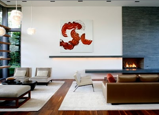
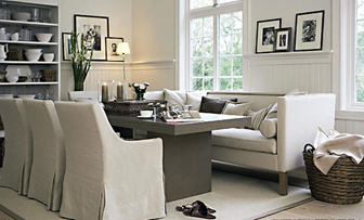
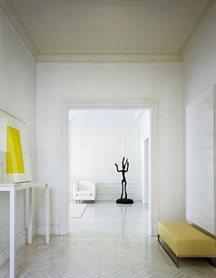
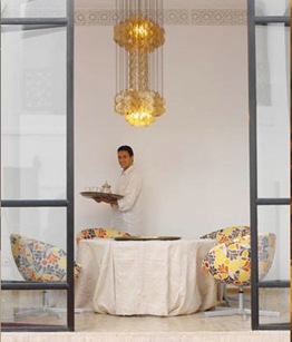
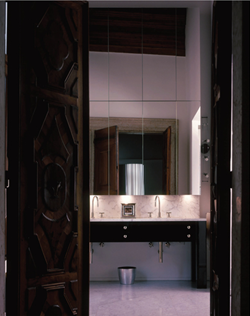
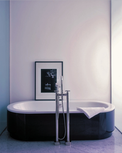
I have to admit a secret of mine...I am a white SNOB - okay now you know my innermost secret. I use only white candles, white dishes, white towels, white flowers (although I have been known to buy colored tulips), and white sheets. Nothing is more classic than white. White dishes set off the food on them perfectly. I cannot have a good sleep on anything other than white sheets, and white candles and white towels are absolute.
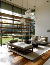
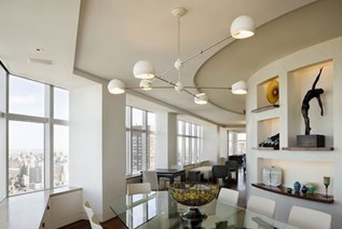
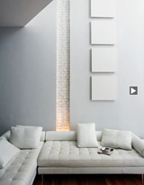
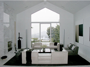
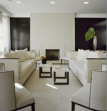
In interiors I love how white highlights good architecture, and any object in the room that has "good bones." White walls are a good backdrop for objects d' art and paintings that are placed in the room - white walls give focus to the lines of the items that are juxtaposed in front of them.
Painting a room white can make it have surprising depth. When I design an all-white room I use several different shades of white to bring out the architectural details, or I layer the space with strong forms in different tones and textures of white and then use some strong color contrasts to outline and bring the white into focus. My all time favorite white color is - Benjamin Moore paint Cloud White. It is a very soft white and easy to live with. It has a chameleon effect - taking on the colors of what is set next to it and changing in tone at various times of the day. Not every white is snow white. Try using whites tinted with: ivory, cream, antique white, and palest beige, blue and yellow. An interesting fact on the popularity of white is that Benjamin Moore has over 140 whites to choose from.
To maximize the light in a room I chose a paint with a semigloss finish rather than the latex matte finish more usual on walls. The "chalkier" matte finish absorbs light; the semi-gloss is more reflective.
Some of my favorite whites I use are are from Benjamin Moore: Cloud White, Simply White, Ballet White, White Dove, White Linen and Designer White.
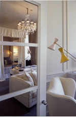
Photo Credits from top: 1 & 2 MLK Studio via All the Best, 3 JK Hotel Milan, 4 David Schefer, 5 Helen Hennie, 6 Trevor Tondro, 7 Jennifer Post, 8 Jennifer Post, 9 Jennifer Post,
10 Ptithabibi Morocco, Towels
Patricia Gray is an award winning Interior Designer in Vancouver, Canada who blogs about WHAT'S HOT in the world of Interior Design.
2010 © Patricia Gray Interior Design Blog™
Monochrome is a term generally used to describe painting, drawing, design, or photography in one color or shades of one color. A monochrome object or image is one whose range of colors consists of shades of a single color or hue. NB. I have shown a monochrome interior in shades of white, but monochrome interiors can also be in shades of green, blue, red, etc. I particularly like this Monochrome interior - Blue Fin Restaurant at the W in New York, because of the way pattern and texture were used to give interest and drama to an otherwise all white space. I haven't eaten here yet, but I want to....I wonder if the food is as good as the design?
If anyone has dined at this restaurant, please let me know.
Photo: Monochrome Interior -The Blue Fin Restaurant W New York Times Square, Interior design Yabu Pushellberg via A Schematic Life
Patricia Gray is an award winning Interior Designer in Vancouver, Canada who blogs about WHAT'S HOT in the world of Interior Design.
I got a new iPhone in December and I have been getting familiar with iPhone Apps. These applications or Apps (for short) are wonderful software programs that are installed directly on the screen of your iPhone - most are free to download, or have a nominally small fee.
These are the iPhone Apps that I have downloaded so far that are proving to be very helpful:
1. Flashlight iPhone App - This App fills the screen of your iPhone with bright white illuminating light. I used it on a job-site last week to look behind a wall to check the position of the gas line in a kitchen renovation. I will also have it handy next time I am in a dimly lit restaurant and can't read the menu!
2. iHandy Level iPhone App - very handy for leveling pictures on the wall, checking that a table is level, etc.
3. Digital Mag iPhone App - great for magnifying those hard to read dimensions on floor plans....also works great to read small print disclaimers, menus, etc.
4. Ben Color Capture iPhone App - I love this one. You take a picture with your iPhone and it matches it up with the exact Benjamin Moore paint color.
5. MacBox Units iPhone App - Units is a really useful app for the iPhone that lets you easily convert from various units into lots of others. Units can convert Area, Currency, Energy, Temperature, Time, Length, Weight, Speed, Pressure, Power, and Volume. As an added bonus Units also has a built in ruler, for doing small, quick measurements when the need arises.
*Best of all Flashlight, IHandy, Digital Mag, Ben Color Capture, and Units are all free iPhone Apps
Please let me know what iPhone Apps you have found helpful by leaving a comment here.
Patricia Gray is an award winning Interior Designer in Vancouver, Canada who blogs about WHAT'S HOT in the world of Design.
Perfection!
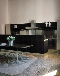
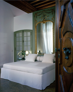
Fabrizio Plessi's Venetian Palazzo
Interiors Magazine Photos: Paolo Utimpherger Magazine Cover: Photos Nathan Kirkman / Design Wendy Posard
Patricia Gray is an award winning Interior Designer in Vancouver, Canada who blogs about WHAT'S HOT in the world of Interior Design.